Thursday, April 4, 2013

TED Talk Reflection

     I was pretty satisfied with how my TED Talk went. Aside from one bump in the beginning, I felt that I was successful in not reading off of my cards, talking at the right speed, and coordinating with my presentation.

     And the most amazing thing: as far as I could tell, I was actually speaking at a normal volume! As you may or may not, in every single presentation I've ever done (I'm actually not exaggerating), I've had some comment about my volume -- apparently I just cannot speak loud enough. But I really tried to speak louder in this one (plus the audion has really good acoustics), and I think I was successful.

     In the beginning of my presentation, I was trying to use a mouse as a remote/clicker, but it didn't work. I'm guessing it couldn't communicate with the computer at that distance. I should've tested that out before I started, but I didn't really think about the distance. However, I don't think that was much of a problem, since Ian jumped in right away to change the slides for me. (Thanks Ian!)

     I was actually really proud of the script I wrote. I didn't read it exactly, since I was trying to not look at my notecards. I tried to incorporate a message about practice (practice makes perfect, basically) into my presentation while using examples from my process.

     I'm not sure what my time was, but when I practiced the night before, I was ending up at around four and half minutes. So hopefully I was around there, since that's right on point.

     I really liked the grading strategy Drew used, so I'm just going to steal that:

Clarity and delivery of intended message: 14/15 (93%)
     -I felt that my message was pretty well-incorporated, but I did tie it into drawing a lot. I think I could've used more examples from other projects/situations to engage the audience.
Description of project/process: 5/5 (100%)
     -I think I described my process pretty thoroughly without going into the actual drawing techniques or anything, since I didn't feel that they applied to my presentation.
Poise and preparation: 4/5 (80%)
     -I spent a lot of time writing my speech and I don't think I looked at my notecards much, so I think my preparation was pretty good. And like I said, I thought my volume finally was acceptable, but unfortunately I had a slight technical problem in the beginning. Also, I stuttered a few times.
Improvement: 4.5/5 (90%)
     - As Drew said, there's always room for improvement. I think I've improved hugely in my presenting skills over these past two years, but I still have a long way to go.

    I'd give myself a 27.5/30 (I apologize for that half point). I really did feel as this was one of my better presentations.

    And I'll leave you with my finalized final product (I added shadows and a horizon line, though nothing's different with the people). I used this in my presentation, but I haven't posted it on my blog yet.


     I'm considering adding some sort of background, but for the sake of this project, I didn't feel that was necessary.

     (Interesting biology fact: Stress activates a hormone pathway from your brain to your adrenal glands (located atop your kidneys), which release the hormone cortisol. However, when a lot of cortisol is secreted, it can affect memory by actually damaging cells in the hippocampus (which is important in memory function). So, too much stress can cause too much cortisol to be produced, which can then damage the hippocampus and ultimately cause problems with memory.
     Basically, I'm trying to say that I actually have little memory of presenting today, which is rather disconcerting. I mean, I remember enough to grade myself, but still...)

Monday, April 1, 2013

OSHDngSJIDBGSDGSDHJGBKdjg

     I finished!!! And I don't think I can express how happy (and surprised) I am at how this turned out!

(Click to see a larger version.)

     I think it's fairly obvious that I improved even just in this drawing. I worked from left to right, starting with the back row and then moving up front. (And since that sentence was kind of confusing: first I drew the guy on the far left, then the standing up one on the right, then the squatting guy, and finally the sitting guy.)

     I wasn't particularly satisfied with the first person, since he ended up kind of disproportionate. I was really happy with how my second drawing turned out, but there were still a few small proportion issues (his left hand, for example). The third turned out wonderfully, except for his face, which I kept messing up. And then the last one. I'm actually not sure how this one turned out so good (all that practice really helps!), but sudhfgjdsfkg I'm just so happy with it!

     Here's the video of me drawing the final person (Nicholas, the singer):


     The song in the background is Tightrope (Acoustic) by Walk the Moon.

     I think learning the basics in my previous six weeks was really helpful to get me started on mastering realistic, full-body drawing. However, I think this piece gave me the practice I needed to produce a really amazing drawing. I stated earlier that I had been struggling with shoes. I definitely had problems in the first part of this drawing, and even for the second person, I felt that I wasn't getting the shading or perspective right. However, by the time I got to the third and fourth people, I felt that my shoe-drawing ability had really improved. (This doesn't just apply to shoes -- I actually feel this way about every single element of the people.)

     I still have to add final touches (such as the shadows behind the band members), and, knowing me, I'll spend a few hours just tweaking random elements of it. When that's complete (probably not tonight -- it's too late), I shall post that picture here.

Sunday, March 31, 2013

Yet Another Time Lapse Video!

     And here I bring you the third installment of videos from this artistic adventure:


Kevin Time Lapse from Annie G. on Vimeo.

     The song in the background is Quesadilla by Walk the Moon.

     As I said before, this sketch was the one I was happiest with. However, when I got to Kevin's face, it just wasn't working. I literally tried and erased it about twenty times (I spared you that pain in the video). His clothes, though, turned out awesome! Of the first three, I think his clothes look the best. I'm especially pleased with his jean jacket.

     I don't think I'll finish editing the last video tonight, but I will upload that as soon as possible tomorrow!

Video Number Two!

     Finally.


Eli Time Lapse from Annie G. on Vimeo.

     I'm actually really satisfied with how this part of the drawing (I was drawing Eli, the guitarist) turned out. For Sean (see previous post), I wasn't particularly happy with how the proportions worked out. However, I feel like I started with a better sketch for Eli, and having a good sketch usually ensures a good final drawing.

     Also, since my last post was kind of all centered around my feelings toward video editing, I forgot to mention that I have pictures of my original sketches.


     I had to make some adjustments from the original image, because apparently I'm not very good at estimating proportions. I think the sketch I'm happiest with is the one of Kevin (second from the left), but unfortunately in the actual drawing process, I succeeded in completely messing up his face. So we'll see.

Saturday, March 30, 2013

I Looooove Video Editing.

     Note the extreme sarcasm.

     Anyway. So this week I've been working on my final product -- a drawing of all four band members of Walk the Moon. I've been video-taping each part of the drawing, and I plan to make a time lapse video for each person.

     I've been using two SD cards (one 8 GB and the other 16), because my video files have not been able to fit on one card. For my first part of the drawing (the drummer, Sean), I imported the video files from both SD cards without trouble, saved them in iPhoto, and went on with my life.

     Then I tried to import the next videos. I imported the files without problems from the first card, and then put the next SD card in the computer and went away from the computer. Three hours later, when I came back, iPhoto was displaying a message: "Delete or Keep Files?" Since I needed to clear the SD card to use it for the next set of videos, I clicked delete. Little did I know that iPhoto was going to stop working.

     I was stuck. I had clicked "Delete Files", the import wasn't complete, and iPhoto wasn't responding. I crossed my fingers and force-quit. After reopening iPhoto, I discovered a severe lack of sixty minutes of video.

     So one temper tantrum, six hours, and five video-recovery programs later, I still lack my videos. (Though I did actually manage to recover one of the files -- only problem is, there's no image (just blackness), and the audio (which I wouldn't have used anyway) is mostly static. So I guess that doesn't really count as recovering the file.)

     On the bright side, nothing affected my videos from my drawing of Sean, so here's that time lapse video:


Sean Time Lapse from Annie G. on Vimeo.

     The song used in the background is Tete-a-Tete by (of course) Walk the Moon.

     I will hopefully have the other videos completed and uploaded by tomorrow, but I still have to do that biorhythms project (yaay precalc), so we'll see. And I'm not giving up on these videos. I will find them. Somehow.

     Moral of the story: NEVER delete video files (or any files, for that matter), until you're absolutely, 100% positive that they are saved elsewhere.

     Update: Turns out iPhoto didn't actually delete the videos from my SD card -- it's just that the iPhoto software hides files it thinks it has already imported. So they were on my SD card the whole time. *facepalm*

     So yeah, that video will be here soon.

     (And on the topic of the drawing and genius project itself: it's going well, and I'm nearly done. I will post pictures tomorrow.)

Wednesday, March 27, 2013

Clothes! (Rather Late...)

     So last week was the week I was supposed to work on clothing... but I didn't really get started on that until the weekend (the 23rd). That was probably mostly due to procrastination.

     Anyway, I stated in my first blog post that I'd like to try four different types of clothing. I didn't do four separate drawings, however, since I combined the first two types into one. First, I wanted to just draw a basic t-shirt. Since I happened to be wearing just that (along with a sweatshirt), I decided to just find a mirror and draw my reflection. Here is the result:


     This drawing encompassed two different styles of clothing. Even though sweatshirts and t-shirt are similar in texture, they have different thicknesses, so they folds differently. Sweatshirts tend to have larger, softer folds (I'm not quite sure how to describe it), while t-shirts make smaller, sharper folds. (Also, my sweatshirt's a bit big, which meant that it folded more than my t-shirt.)

     Since I wasn't focusing on hands or faces or anything this week, I just did simple, blocky sketches for the hands and ignored the face altogether. (Which makes it a rather creepy drawing, but oh well.) Side note: if you're trying to draw a black sweatshirt, make sure you have good lighting or you'll have to make up most of the shadows. Which can be very annoying.

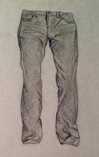
     Next, I decided to draw jeans. In the picture I selected for my final product, all four band members are wearing jeans, so that seemed to be the best thing to practice. (Maybe in the future I can try out things like sweatpants, skirts, etc., but for the purposes of this project, I just decided to focus on jeans.


     These were surprising difficult -- jeans, being kind of stiff, fold oddly and often. Folds, as I think I've mentioned before, are such a pain to draw, since they require a LOT of shading and highlighting. I'm still not quite happy with how the folds turned out at the bottom of the legs, but I have four more times to practice that in my final product! (Again, the disembodied legs are a little odd, but I wanted to focus only on the jeans.)

     Lastly, I decided to try shoes. In the past, I've found shoes to be very challenging, and I haven't really understood why I have so much trouble. Every time I try to draw them, the perspective ends up a little off, which is odd, because that's not something I normally have trouble with. I considered this for this drawing, and made sure to sketch it and redo it if need be until I was happy with the sketch.


     The shoes don't look exactly like the picture I was drawing from, but I still think they look quite shoe-ish, so I'm satisfied. I picked Converse (Chuck Taylors, whatever you wanted to call them) to draw, since most of the band members are wearing them in the photo I picked. And again, I'll be able to practice shoes through my final product.

    I had three sources this time: two websites about drawing clothes, and a book about figure drawing. My second source under my citations was a basic website that listed areas where folds usually appeared (at the ankles, where a shirt is tucked in, etc.), and inconsistencies in folding, such as texture and size of clothing. The first source in my citations built upon the other source. It focused a lot on how the light hits clothes, and what shadows or highlights it causes. It also discussed how different textures creates different shadows. (Basically, the source I first mentioned said what are where folds are, and the second explained how to draw them.) The third source wasn't about clothes, and instead focused on getting proportions right for figures. It recommended sketching out general shapes before adding detail, which is something I always make sure to do.

     Updates on my final product are coming soon!

Citations:
Boomhower, Doug. "Drawing Clothing Textures." Learn to Draw Expressively. Web. 23 Mar. 2013. <http://www.learn-to-draw-expressively.com/drawing-clothing.html>.

"How to Draw Clothing." CraftyArtWorld.com. Web. 23 Mar. 2013. <http://www.craftyartworld.com/howtodrawclothes.php>.

Meyer, Susan E., and Martim Avillez. "Figure Drawing." How to Draw in Pen and Ink. New York: Collier, 1985. 123-33. Print.

Tuesday, March 19, 2013

Vlog!

     A video in which I blather about inspiration and stuff.


Annie's Vlog! from Annie G. on Vimeo.

     The song I used in the background is Something Good Can Work by Two Door Cinema Club.

     I apologize for all the jumpcuts, but I think it's safe to assume no one wishes to watch the about three minutes of footage I have of me thinking of what to say...

     I attempted to create some sort of universal message (you have to push yourself to work and practice to get better at something) at the end of this video... Hopefully that worked.

Monday, March 18, 2013

More Hands!

     Last week I said I'd draw some more hands and post them, so here they are:

Since last time I drew my hand, I figured it was a good idea to try a more manly hand. (Male hands are generally stockier than female hands, and I thought it was important to practice those as well.)

Next I decided to draw a more complex hand (as well as an arm). I included the bracelets and microphone from the picture. (As a side note, this is actually the hand of one of the band members I plan on drawing for my final product.)

     I tried to do different sizes of hands this week. Last week, I did both of the hands life-sized, which is much easier. This week, however, I made both smaller. The first drawing is about three inches from the tip of the pencil to the base of the thumb, which is about 60 or 75 percent of life size. The second hand is about a half of an inch across -- about 12.5% of life size. Drawing the hands smaller was a challenge because I had to make sure I kept the proportions the same. I'm glad I practiced this, though, because I'll have to draw the hands smaller in my final product.

     I also found another source to help me in drawing hands: Draw Real Hands! (see citation below). It had separate chapters for male and female hands, which discussed the differences (for example, male hands are more angular and female hands are more slender and delicate). The book also a section about incorporating props into drawings (how the hand holds them, for example), which was helpful for the drawings I did this week.

     One of the most helpful points in Draw Real Hands! was about identifying the light source. Since shading is what makes the hand seem realistic, having correctly placed shadows is essential to the drawing. It helped me to shade the hands better, since before I sometimes guessed at where to place shadows. By identifying the light source first, I knew where to darken or lighten the shadows -- areas opposite from the light would be darker than areas closer to the light.

     Of course, this week is drawing clothes, so that blog post will be up soon. This was just a supplemental post form last week. Stay tuned!

Citation:
Hammond, Lee. Draw Real Hands! Cincinnati, OH: North Light, 1997. Print.

Sunday, March 10, 2013

Hands are Quite a Handful

     This week was hands-drawing week! One of my resources stated, "A hand that looks somewhat realistic is one of the most complex body parts to draw" ("How to Draw Realistic Hands" 1). After reading this quote, I was a little worried as to what I was getting myself into.

     I found two different resources (both video tutorials) on how to draw hands. They each approached the task in a different way, and I thought it would be good to try both and see which I liked better.


     The first video (found within the second citation below; direct link in first citation) suggested drawing reference lines (such as a rectangle for the palm, a triangle for the bottom of the thumb, etc.) before beginning any details. I used my left hand as a model. This is the result:


     The tutorial then suggested adding in lines on the fingers and palm as well as rounding out any sharp edges.


     Lastly, I added in shading to make the hand look realistic. Shading was pretty tough, considering the amount of lines in hands. The tutorial mentioned that you don't need to include every single line -- just the main ones, like at your knuckles or around the large muscle below your thumb.


     Altogether, I really liked this method. By breaking everything down into basic shapes, it made beginning the drawing seem like a less daunting task. However, it took more time than I would've liked.

     The second video (the third citation below) took a more difficult approach. The artist in the video suggested using your other hand for reference, and drawing only what you saw. She said numerous times throughout her drawing, "I'm not making anything up." The technique was the first do a simple line drawing of the hand without any shading.


     This was quite a bit harder than I thought it would be. Since I was using my own hand (and in a specific position), I had to make sure not to move too much, or my perspective would be off.

     Next, I was told to add in rough shading (without any smudging). The artist paid special attention to the darkest areas, so I made sure to shade those in a lot.


     Finally, I smudged the pencil marks to create a more natural shading.


     I found this technique to be quite a bit harder than the other one. Since I had to go straight off of what I was seeing rather than drawing reference lines first, there was more trial and error, and more erasing. However, the reference lines and getting everything in proportion from the first method took longer than this method.


     Overall, I think I liked the second, more free-hand technique better. I plan to try a couple more hands with that method, and I will upload those picture when I've finished.


Citations:

Crilley, Mark. "How to Draw a Hand (With Spoken Explanation)." Video blog post. YouTube. 01 Oct. 2007. Web. 08 Mar. 2013. <http://www.youtube.com/watch?v=1NQy-a3rvQs>.

"How to Draw Realistic Hands." Web blog post. Squidoo. Web. 08 Mar. 2013. <http://www.squidoo.com/how-to-draw-realistic-hands>.


Roberts, Di. "How to Draw Professional Looking Hands." Video blog post. Videojug. Web. 08 Mar. 2013. <http://m.videojug.com/film/how-to-draw-professional-looking-hands>.

Thursday, February 28, 2013

Jenna's Face

     For my first week, I decided to focus on faces. I've drawn faces numerous times before (see below), but it's been a while, so I decided to focus on them again for a week.


     I had no idea who to draw, so I consulted my friends (Ally Dworetsky and Jenna Rollins), and naturally they wanted me to draw them. Originally, I was reluctant, but when I couldn't think of anything else, I decided I would draw Jenna.

     However, before actually drawing a face, I wanted to focus on mouths. I've struggled in the past with drawing mouths, so I found an instructional blog online (see citation at bottom) and practiced. These are the results:


     The first one I did (on the left) wasn't that great, but I felt like I improved more during the second drawing. Then I felt ready to take on the task of drawing one Jenna Rollins.

     It took me about two and a half hours to draw Jenna, and I video-taped the entire thing. I then cut out the most boring parts (such as sketching the outline) and (somehow) got the video down to about seventy minutes. The song that I picked to play in the background is about 3:05, so I had to speed up the video a lot (2300%, actually). (This involved using three different video-editing programs, which made it surprisingly difficult just to speed up video... But this blog is about drawing, not my struggles with frustrating video programs.)


Jenna Drawing Time Lapse from Annie G. on Vimeo.

     And here is the finished product:


     I can't really describe my techniques for drawing other than that I sketch the general shape and then started shading and adding detail. Generally, I start with the eyes, since they give life to the drawing. From there I usually spread from the center out, by working on the nose, then the hair, etc. Hopefully the video sufficiently shows the process.

     I did a little practice on clothing when drawing Jenna's shirt, but I will definitely do much more intensive practice in two weeks (during my clothing-focused week). Next week I will focus on hands.

Citation:
Prokopenko, Stanislav. "How to Draw Lips." Web blog post. Stanislave Prokopenko (Fine Art Painter). July 2009. Web. 24 Feb. 2013.
<http://www.stanprokopenko.com/blog/2009/07/draw-lips/>.

Thursday, February 21, 2013

Goals and More

  I've loved drawing my entire life. However, when I was younger, I drew mostly animals, and I had never tried to draw humans until recently. About a year ago, I had to draw a self-portrait for art class, and I found that I really enjoyed drawing humans. I spent time in art class and art club meetings refining this skill, and over the past summer I finally produced a drawing that I was very proud of.

(Nate Ruess)

  However, while I've spent quite a bit of time practicing drawing faces, I've never even tried to draw a realistic full-body person. I believe this is the next step in mastering realistic drawing, and the genius project is a good place for me to work on this.

     For the first week (the week of February 25), I'll focus on drawing human faces. My goal for this week is to draw at least one full face, and also spend some time concentrating on specific facial elements (noses, eyes, and mouths are the most challenging). I plan to visit the library this weekend to find a few books on this subject. I will look online for blogs if I can't find any sufficient books.

     During the second week (the week of March 4), I'll focus on hands. My goal is to perfect hands, and I will do so by drawing various types and sizes of hands. I plan to ultilize drawing books that focus specifically on hands to help me improve at drawing them.

     For the third week (the week of March 11), I will work on clothes. Clothes are (from what I've heard) the most challenging element to draw. They will also probably take a considerable amount of time, since there's such a large range of textures and types of clothing. I plan to use drawing books to try out various styles. I don't have a specific quantitative goal yet, but I want to try drawing at least four different styles of clothing (ex. jeans, t-shirts, etc.).

     My last two weeks (March 18 and March 25) will be spent on my final product. Since my overall goal for this project is to be able to draw a realistic full-body human, I want my end result to show that I have achieved that. I plan to draw a realistic, full-body picture of one of my favorite bands, Walk the Moon. I'll have to combine and apply the techniques I will have worked on for the previous month to create my final drawing. Since there are four members, I'll be able to experiment with different faces, body shapes, and clothing textures. Hopefully through the genius project, I'll be able to refine and perfect my realistic drawing skills.

     So far, I've found one general drawing book, though I plan to find more specific ones when I go to the library this weekend.


     I was able to get Sketching People & Places In All Mediums by Jose M. Parramon. This book covers the basics of the human body as well as tips on sketching, shading, etc. It should provide a good basis for beginning my genius project.